by Patrick Fearon-Hernandez, CFA, and Thomas Wash
[Posted: 9:30 AM ET] | PDF
Good morning! The market is currently digesting the latest comments from President Trump regarding China. In sports news, reigning champions Real Madrid secured a dominant victory over Manchester City in the UEFA Champions League playoffs. Today’s Comment will cover our insights on the recent FOMC meeting minutes, provide an update on the Republican effort to advance President Trump’s agenda, and discuss other market-related developments. As usual, we will also summarize key international and domestic data releases.
Fed Cuts On Hold: The minutes from the January FOMC meeting revealed that Fed officials remain cautious about adjusting monetary policy. Their hesitation stems from concerns over the recent uptick in economic activity and uncertainties surrounding recent policy proposals. Additionally, officials started discussions about their plans for further quantitative tightening.
- In January, the committee unanimously voted to hold rates steady as it awaits clearer signs of progress on inflation. Fed officials highlighted concerns about upside risks to inflation, citing potential trade restrictions, a slowdown in immigration, and geopolitical tensions that could disrupt supply chains. Additionally, they noted that seasonal factors might further complicate the assessment of inflation trends.
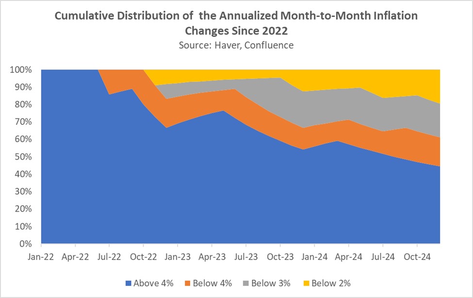
- Their comments came ahead of the latest CPI report, which showed a stronger-than-expected acceleration in inflation for January. While factors such as auto and tenant insurance, along with egg prices, drove much of the increase — likely on a temporary basis — goods inflation moderated notably. This has raised concerns that progress on inflation may be stalling.
- Regarding the Fed’s balance sheet, the central bank believes that reserves remain abundant but cautioned that the debt ceiling may be obscuring underlying issues. Consequently, there is concern that once the debt limit is lifted, reserves could decline more rapidly to levels deemed “appropriate.” As a result, officials also discussed temporarily suspending the balance sheet runoff until the debt limit issue is resolved.
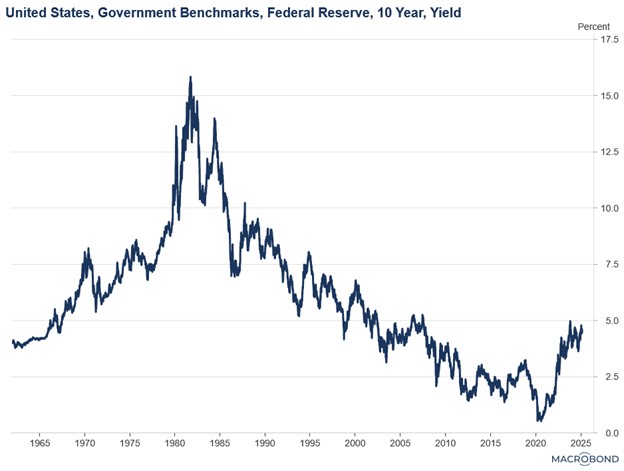
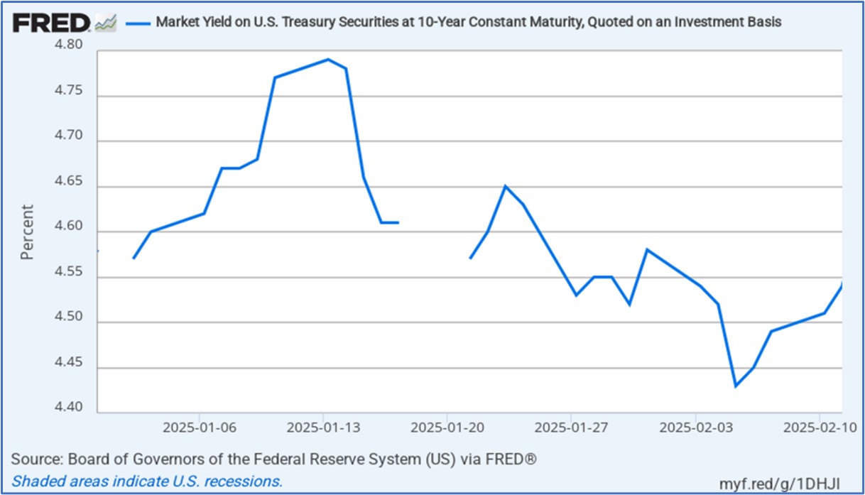
- The potential end of the balance sheet runoff is likely to provide a much-needed boost for US government bonds, as it is expected to increase demand. That said, a moderation in inflation and additional Fed rate cuts could also push long-term yields lower.
Trump Picks a Side: President Trump has thrown his support behind the House Republican tax cut bill, aiming to consolidate all his priorities into a single comprehensive piece of legislation, which he has famously described as “one big beautiful bill.”
- The president’s decision comes amid escalating tensions between Senate and House Republicans, who are struggling to align on a cohesive strategy to advance the Trump administration’s agenda. The primary divergence lies in their approaches. The Senate bill seeks an early victory by prioritizing immigration reform and raising the debt ceiling, thereby creating breathing room to deliver on tax reform. In contrast, the House bill adopts a more comprehensive approach, aiming to tackle all pressing issues simultaneously.
- The differing approaches stem from concerns that the House bill may lack the necessary support to pass through Congress. While it includes tax cuts, it also proposes reductions to certain social spending programs, which are likely to face significant pushback from moderate lawmakers. Moreover, such opposition could delay lawmakers’ ability to meet the March 14 government funding deadline, potentially exacerbating market uncertainty.
- So, while the president has indicated a preference for the House bill, he has also expressed willingness to support the Senate bill to ensure the legislation moves forward. Furthermore, the White House has shown openness to reducing defense spending as another avenue for achieving savings. We remain optimistic that a new tax bill will be passed this year, which would be highly bullish for US equities.
China Deal Possible? President Trump believes he can still secure a trade deal with China, despite rising tensions. His comments come just a few weeks before tariffs on Mexico and Canada, which the administration plans to impose, are set to take effect on March 4.
- Trump imposed a 10% additional tariff on imports from China shortly after taking office in January, citing concerns that China was not doing enough to curb the flow of fentanyl into the US and to address its unfair trade practices. While his decision was widely expected, the tariff rate was significantly lower than the 100% tariffs he had promised during his campaign, suggesting a potential moderation in his stance.
- That said, his true intentions remain unclear. The president may be using China as a signal to other countries that he is open to negotiating deals. Notably, his comments come just a day after he pledged to impose 25% tariffs on autos, pharmaceuticals, and semiconductors.
- So far this year, the dollar has weakened significantly amid signs that the president is less willing to pursue aggressive tariff measures than many had feared before he took office. This trend could continue if he steps back from other trade-related threats.
Canadian Elections: The Conservative Party’s once-insurmountable lead has narrowed significantly in recent weeks, raising doubts about its ability to form a strong coalition in the upcoming election.
- Recent polling reveals a decline in voter trust in the US, likely influenced by trade disputes and jokes about the country’s potential statehood. Voters express greater confidence in the Liberal party’s ability to advocate for them in dealings with the US.
- Additionally, Prime Minister Justin Trudeau’s decision to step down has contributed to the party’s surge in support, as he had become deeply unpopular with the public. His departure has been a central theme in the Conservative Party’s messaging, particularly due to his support for a carbon tax.
- The latest polls show that the Conservative Party’s advantage has narrowed significantly, dropping from an 18% lead over its Liberal rivals to just 7%. The survey indicates that the Conservatives now hold 39% of public support, compared to 32% for the Liberals.
- The rise of the Liberal party could compel the Conservatives to adopt a more confrontational trade policy toward the US to win sufficient parliamentary support. Such a strategy increases the risk of escalating trade tensions between the two nations.