by Bill O’Grady, Thomas Wash, and Patrick Fearon-Hernandez, CFA | PDF
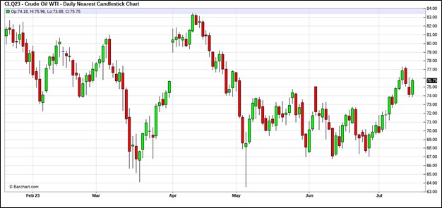
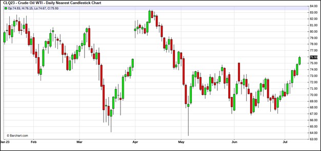
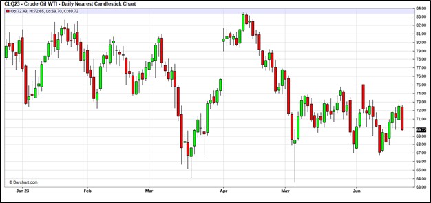
Oil prices have moved into the upper end of the trading range.
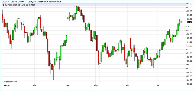
(Source: Barchart.com)
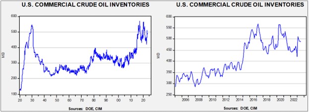
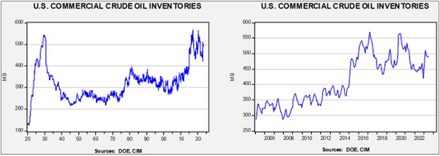
Commercial crude oil inventories fell 0.6 mb, less than the 2.0 mb draw forecast. The SPR was unchanged.
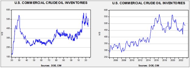
In the details, U.S. crude oil production fell 0.1 mbpd to 12.2 mbpd. Exports rose 0.8 mbpd, while imports declined 0.8 mbpd. Refining activity fell 0.9% to 93.4% of capacity.

(Sources: DOE, CIM)
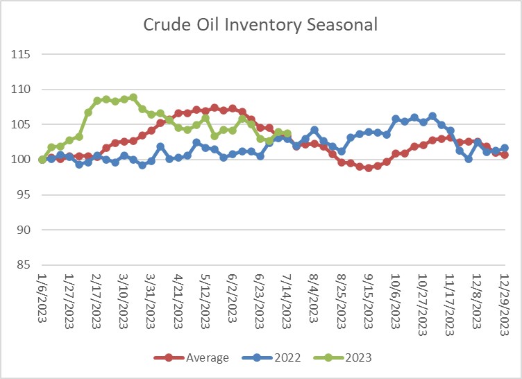
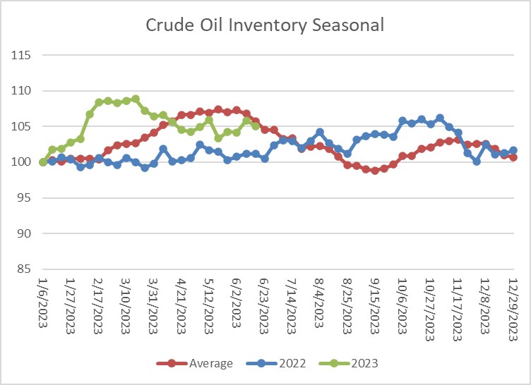
The above chart shows the seasonal pattern for crude oil inventories. Current inventories are falling but at a slower-than-normal pace. If we follow the seasonal pattern, stockpiles should continue to fall into mid-September.
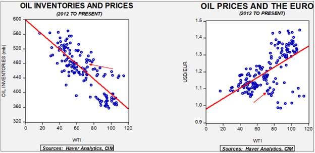
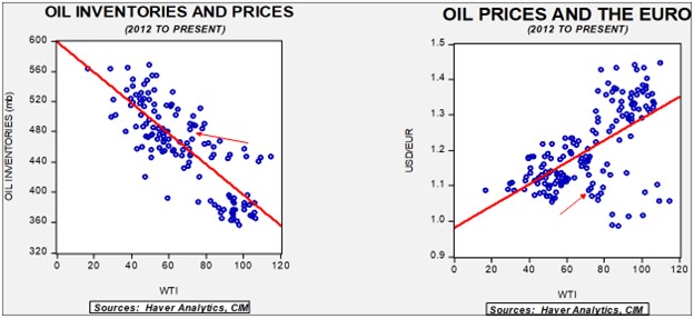
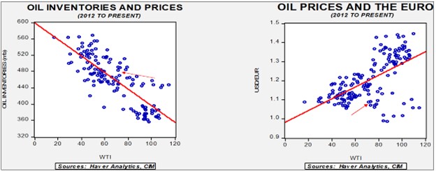
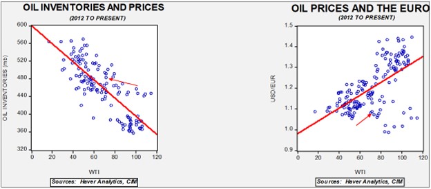
Fair value, using commercial inventories and the EUR for independent variables, yields a price of $60.14. Commercial inventory levels are a bearish factor for oil prices, but with the unprecedented withdrawal of SPR oil, we think that the total-stocks number is more relevant.
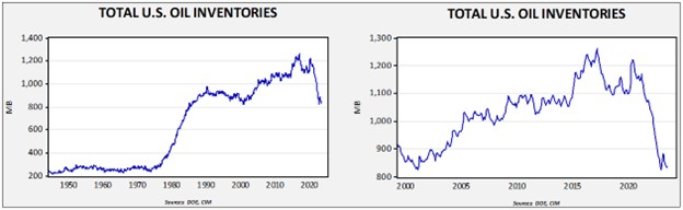
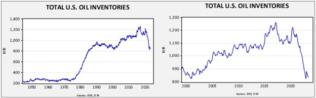
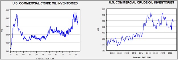
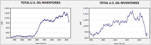
Since the SPR is being used, to some extent, as a buffer stock, we have constructed oil inventory charts incorporating both the SPR and commercial inventories.
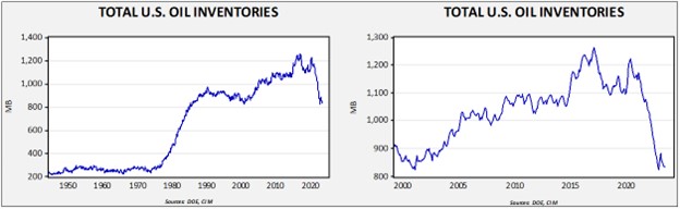
Total stockpiles peaked in 2017 and are now at levels last seen in 2002. Using total stocks since 2015, fair value is $93.10.
Market News:
- The Biden administration is projecting it will make a modest purchase of SPR oil this year, around 12 mb. Obviously, this amount pales in comparison to the sales over the past 18 months. Part of the reason for the slow injection is that the infrastructure may not be able to handle aggressive injections, but the bigger reason is that there is simply a lack of urgency to refill the reserve. Some of the reluctance is due to cost; like dieting, saving isn’t fun. Another reason is that the shale revolution means there is less vulnerability to world events, and if the world reduces its use of oil, the SPR could become stranded. Still, the SPR does act as a supply buffer, not just for the U.S. but the world. China has been doing the opposite of the U.S., which is building its reserve. Of course, cheap Russian oil has created this opportunity for Beijing.
- As India industrializes, its energy demand is rising. The country is becoming an important source of incremental oil demand.
- Argentina is expanding its natural gas exports.
- Due to falling water levels, Kyrgyzstan has declared an energy emergency.
Geopolitical News:
- Although U.S. foreign policy has clearly signaled a desire to reduce its focus on the Middle East, Washington has decided to expand its military capability in the region in response to ship seizures by Iran. Iran’s behavior is clearly an irritant and distraction, but it also shows that no other military is able to fill this stabilizing role in the near term.
- The U.S. is considering placing air defense systems in Iraqi Kurdistan due to threats from Iran.
- Iran is equipping its navy with long-range cruise missiles.
- In recent reports, we have been documenting this summer’s heat across the Northern Hemisphere. Iran is dealing with extreme levels of heat this year, which is leading to water problems.
- Iran has become closely allied with Russia and China, but apparently there are limits to that alliance. Iran announced that its deal to buy Su-35 fighters from Russia has fallen through. Although no official reason was given, it appears that Russia was uncomfortable giving Iran its best military technology. Iran is also suggesting it has an indigenous substitute.
- The net effect of the Western sanctions against Russia has not been a reduction in oil supplies, but rather a massive restructuring of the global oil market. One way the market has changed is that the former dominant oil trading firms have shied away from Russian trade, opening up opportunities for smaller firms to fill the gap created by sanctions.
- We are also seeing new buyers for U.S. crude oil as shipping patterns adjust. Asian buyers are purchasing U.S. crude oil in the face of rising Middle Eastern prices.
- Iraq has been a conduit for Iran to evade sanctions. The U.S. has taken steps to crack down on the illicit dollar trade between Iraq and Iran by banning 14 Iraqi banks from the dollar network.
- China is taking steps to reduce its dependence on foreign energy supplies. Recently, it has been drilling ultra-deep onshore wells in search of natural gas. Given the costs, this investment is probably only justifiable on national security concerns. China is currently the fourth largest producer of natural gas. Although official data is lacking, there is a high likelihood that China is boosting imports to fill its SPR.
- Afghanistan has struggled since the early part of the century. It harbored al Qaeda after 9/11, leading the U.S. to invade the country to oust the Taliban. The U.S. occupation continued until 2021, when the Biden administration engineered a chaotic exit. The Taliban returned to power, but to some extent, it was a Pyrrhic victory. Few nations wanted to deal with the regime, and it has faced its own internal unrest. However, one bright spot for the Taliban is that Afghanistan holds rich lithium deposits. China is making inroads into Afghanistan, hoping to exploit this resource.
- The Kingdom of Saudi Arabia and China continue to deepen their economic ties. Saudi Aramco (2222, SAR, 32.25) recently completed a deal to take a 10% stake in China’s petrochemical industry.
- In Sweden, demonstrators have allegedly been burning Qurans; in response, the Swedish embassy in Baghdad was stormed by protestors.
- Oil and gas deposits in the eastern Mediterranean are becoming an important source of hydrocarbons for the Middle East and Europe. The West is dominating this development, acting as a counterweight to other Middle Eastern producers.
Alternative Energy/Policy News:
- When China restricted Japan’s access to rare earth minerals in 2010, it highlighted China’s dominance in this market. In reality, rare earths are not all that rare. What allowed China to dominate the market was that the mining and processing of these minerals tend to be disruptive. China was simply willing to suffer the environmental costs. But as other nations realized the vulnerability they faced from Beijing’s whims, we have seen a concerted effort to build mining capacity outside of China. This report on Sweden’s mining activity is an example.
- The Inflation Reduction Act (IRA) provides subsidies to firms building clean energy facilities in the U.S. Foreign firms have been aggressively taking advantage of the opportunity. This outcome suggests foreign firms are participating in the reindustrialization of the U.S.
- The IRA is also fostering the EV battery recycling industry. As EVs become more prevalent, scrapping the vehicles after their useful life expires creates new problems. Recycling the batteries reduces the problems of dealing with old EVs.
- In fact, recycling may be part of the solution in meeting the demand for EV metals.
- The U.K. is also subsidizing battery production.
- One of the favorable factors of markets is that prices signal to both consumers and producers to adjust their behavior. The decentralized characteristic of markets creates efficiencies that central planning, to date, hasn’t been able to duplicate. The EV revolution will increase demand for copper, and as copper prices have increased, producers are looking for ways to use less copper. Most of the adjustments, so far, have been in modest engineering changes. We still expect copper demand to be strong in the coming years, but the simple extrapolation of demand from current use is probably overestimating future consumption.
- Another example of the evolution of the EV industry is the solid state battery. Toyota (TM, $165.40) claims to have a battery with a 745 mile range.
- The Greens in Germany are part of the currency ruling coalition. Ostensibly an environmental party, it has moderated its positions over the years to increase its political power. However, true to its roots, it has supported an aggressive policy stance of replacing boilers in German homes with heat pumps. The plan has turned out to be very unpopular and may undermine the current coalition.
- EVs are fair weather vehicles, as it turns out. It’s well known that extreme cold weather reduces battery range. Evidently, hot weather has an even greater negative effect.
- The environmental movement is plagued by a purity constraint as virtually every technical solution to an environmental problem will create an adverse impact on some part of the ecosystem. A recent lawsuit against the EPA argues that biofuels likely violate the endangered species act.