

Author: Rebekah Stovall
Asset Allocation Weekly (December 11, 2020)
by Asset Allocation Committee | PDF
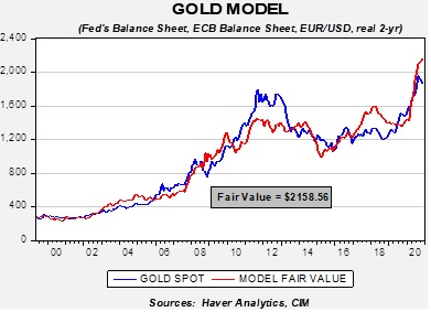
After peaking at $2,063 in early August, gold prices fell to $1,760 at the end of November. This is a notable decline and, because our asset allocation models have included precious metals since 2018, it makes sense to see if anything has changed. We have several different ways to examine the price of gold. In general, the outlook is mixed; the underlying fundamentals remain solid, but competition for investment flows is putting a damper on gold prices.
Based on our gold model, prices are attractive at current levels. The model uses real two-year Treasury yields, the EUR/USD exchange rate, the balance sheets of the Federal Reserve and the European Central Bank, and the U.S. fiscal account scaled to GDP. As the chart suggests, current prices are below the model’s forecast.
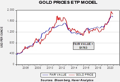
At the same time, a model based on the amount of gold held by exchange-traded products (ETPs) suggests gold isn’t attracting investment flows relative to its fundamental attractiveness.
Although optimism surrounding equities is likely diverting funds that may have gone into gold, the price action in bitcoin may also be having an impact. Bitcoin remains a controversial topic; its value appears to be ephemeral (in theory, one can create scarcity of anything, but it has little value without demand for it). Its initial construction suggested it was a digital currency designed for transactions. It has mostly failed in that endeavor, at least for legal transactions, but it has shown to have store-of-value characteristics. As such, it has similar characteristics to gold without the same issues of storage.[1] Recently, we have seen a sharp rise in bitcoin prices, which may be siphoning off demand that would usually go to gold.
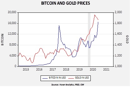
Since late 2014, gold and bitcoin prices are positively correlated at the 70.9% level. In 2017, we saw a spike in bitcoin that collapsed. The key question is whether we are seeing a repeat in the current situation or something different. It is difficult to tell, but the most likely situation is that bitcoin isn’t replacing gold but is a complement. Currently, bitcoin appears a bit expensive compared to gold (a simple model suggests bitcoin should be closer to 12,000), but it had been running below gold for most of this year. Thus, we view the recent rally as more corrective in nature, although the recent spike suggests bitcoin is now excessively valued. Another item of note is that when we had a financial crisis in February into late March, bitcoin plunged while gold maintained its value. The financial system was in a perilous position in late Q1 and bitcoin was not the safety asset of choice when there were high levels of fear. At the same time, we cannot discount the attractiveness of bitcoin and, if investable products are eventually created, it may have a place in portfolios.
Overall, we remain bullish on gold. The underlying fundamentals, as shown in our base model, are very attractive and suggest current prices are undervalued. We do think bitcoin has taken some of the luster from gold, but in the long run we believe the two assets are complementary. With monetary and fiscal policy remaining expansive, the case for commodities, in general, and gold, in particular, is favorable.
[1] Both assets require storage, but one is quite physical whereas the other has, in theory, unlimited storage capacity. For example, if one is trying to live in a failing state, gold may have little value due to its weight but a cryptocurrency that can be easily transferred is attractive.
Weekly Energy Update (December 10, 2020)
by Bill O’Grady, Thomas Wash, and Patrick Fearon-Hernandez, CFA | PDF
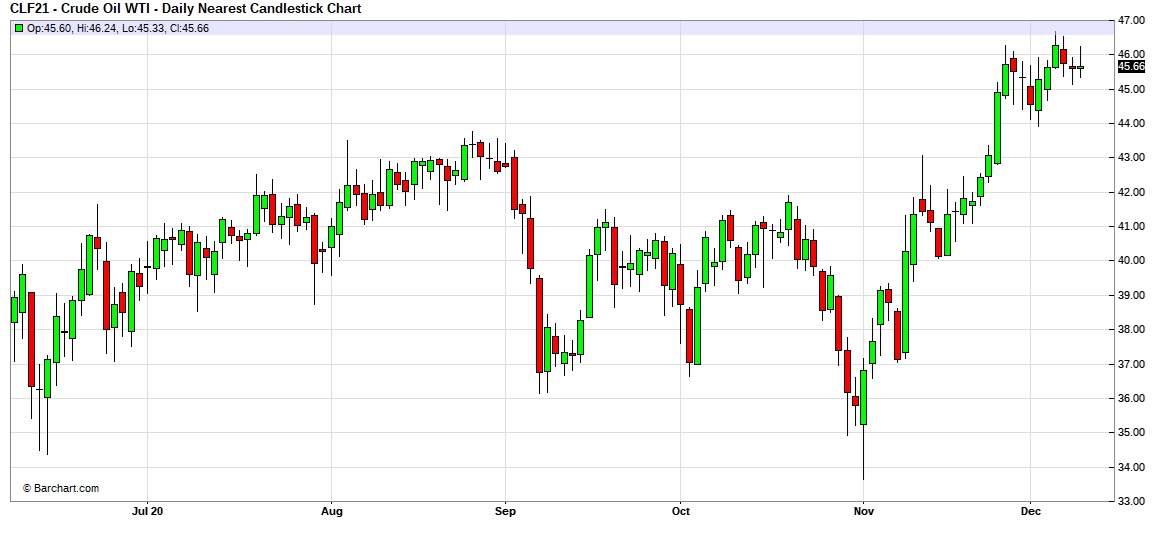
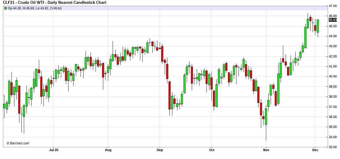
Here is an updated crude oil price chart. Prices are consolidating after the late November rally.
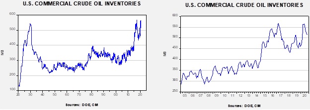
Commercial crude oil inventories unexpectedly jumped 15.2 mb when a 1.0 mb draw was expected. The SPR fell 0.1 mb; there is still 3.1 mb of storage in excess of the 635.0 mb that existed before the pandemic.
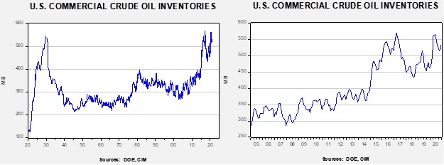
In the details, U.S. crude oil production was unchanged at 11.1 mbpd. Exports fell 1.6 mbpd, while imports rose 1.1 mbpd. Refining activity rose 1.7%. The unusual build appears to be a combination of rising imports and falling exports.
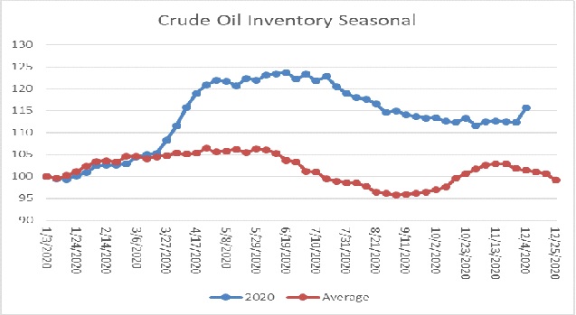
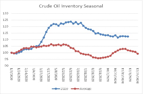
The above chart shows the annual seasonal pattern for crude oil inventories. This week’s data shows the large rise in crude oil stockpiles, which is clearly contraseasonal. Inventories are past their second seasonal peak and usually decline into year’s end.
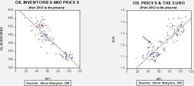
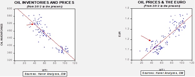
Based on our oil inventory/price model, fair value is $39.28; using the euro/price model, fair value is $69.41. The combined model, a broader analysis of the oil price, generates a fair value of $52.68. The wide divergence continues between the EUR and oil inventory models. This week’s jump in oil inventories led to a large decline in the oil model forecast, while the weaker dollar boosted the EUR model forecast. Overall, the dollar probably has a greater impact on oil prices and thus should keep the market elevated despite the increase in supply.
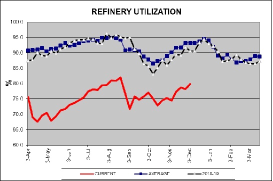
The above chart shows refinery utilization. Although run rates rose, they remain nearly 15 percentage points below average, reflecting weak demand.
In case you missed it, check out this interactive chart of U.S. energy consumption. Starting in 1800, it shows the shift from biomass to fossil fuels. It’s a chart you will want to keep. And, here is a primer on Cushing, OK, the delivery point for the NYMEX oil futures contract, a little town in Oklahoma that is a web of pipelines and a sea of storage facilities.
In Middle East news, two Iraqi oil wells in the Khabbaz field in Kirkuk were set ablaze by explosions carried out by Islamic State. Although the attack had only a modest effect on prices, Islamic State has been intensifying its efforts in this area, reflecting the lack of security in Iraq. Although Kuwait has an ample sovereign wealth fund, the emirate is facing a cash crunch as weak oil prices have reduced revenue and the economic slowdown has increased spending. Moody’s downgraded Kuwait’s debt in September over these concerns.
We have been documenting the decline in product demand due to the pandemic. Although recessions tend to be bearish for energy demand in general, this one has led to a sharp decline in mobility and has crimped gasoline demand. We are starting to see a ripple effect through the refining industry. Refiners have struggled with margins for years and the drop in demand has led to the closure of some refining operations. These closures have been especially pronounced in the West, where many of the facilities are small and old and thus more costly to operate. In Asia, there has been an increase in refining capacity and it is likely that, in the future, the West will be importing product from Asia.
On the alternative energy front:
- A potential battery breakthrough could have a significant impact on the electrification of vehicles. Although all are familiar with lithium batteries, the actual amount of lithium in these batteries is small because the metal is unstable. In practical terms, it has a tendency to catch fire if charged too quickly. This is why airlines are uncomfortable with lithium batteries in cargo holds. Specifically, lithium creates spikes called dendrites. Over time, these dendrites form on the anodes of a battery and can cause it to short circuit. A company called QuantumScape (QS, USD, 70.47) claims to have solved the problem by creating a solid state lithium battery. If true, it would dramatically shorten recharging times (it can reach an 80% recharge in 15 minutes), with more density and longer-lasting. If this battery works as advertised and is affordable, it would be a significant leap and likely improve adoption of EVs.
- Oil majors are facing increasing pressure to decarbonize. Shell (RDS.A USD, 37.46) had several clean energy executives leave over a disagreement on the pace of change at the company. The company says it wants to be at “net zero” by 2050. Meanwhile, Exxon (XOM, USD, 43.35) is facing pressure to replace board members with ones more amenable to climate mitigation. We also note the company has been slow to roll out its carbon capture program.
- Tom Vilsack has been chosen for Ag secretary. He has had that role before; one thing we will be watching for is growing interest among farmers to participate in carbon sequester. It may be possible for CO2 to be captured by cover crops, which would bring additional revenue to farmers. We will be watching to see if Vilsack becomes a proponent of this idea.
- Toyota (TM, USD, 140.70) is planning a new set of EVs. It is also offering its second generation of fuel cell vehicles.
View PDF
Weekly Geopolitical Report – The Disputed Territory of Nagorno-Karabakh: Part II (December 7, 2020)
by Thomas Wash | PDF
After a six-week war, Armenia regretfully conceded some of the disputed region of Nagorno-Karabakh to its longtime rival Azerbaijan. Making matters worse, Armenian President Armen Sarkisyan admitted that he wasn’t even involved in discussions regarding his country’s surrender. As of today, ethnic Armenians have evacuated the conceded regions, while Russian peacekeepers have moved in to ensure a smooth transition. Although the peace treaty appears to be holding, it isn’t clear that this conflict is fully resolved. However, the Nagorno-Karabakh conflict does appear to have caused a seismic shift in the power dynamics within the Caucasus.
The Caucasus has long been dominated by the Russia, but regional conflicts appear to be undermining its standing. The most recent standoff between Armenia and Azerbaijan has not only allowed Turkey, a NATO member, to encroach on traditionally Russian territory, but it has also given Turkey a stage on which to demonstrate its improved military capabilities. Even though this is the third conflict in which Turkey and Russia have taken opposing sides, the others being Syria and Libya, it doesn’t appear the two countries are on course for direct conflict. That being said, as the West continues to withdraw from the region, it is likely that Turkey will look to fill the void.
In Part II of this report, we will focus on the significance of the Nagorno-Karabakh conflict in understanding the global shift in geopolitical dynamics. We will begin with a broad overview of frozen conflicts, particularly after the collapse of the Soviet Union. Afterwards, we will discuss the West’s influence and its subsequent decline in mediating conflicts outside of its borders. We will then discuss the rising prominence of regional powers in resolving these issues and what it could mean for the West going forward. As usual, we conclude this report by discussing possible market ramifications.
The Case for Small Caps (December 7, 2020)
by Bill O’Grady, Mark Keller, and Dan Winter | PDF
To measure market capitalization, we use the Wilshire Large Cap and Wilshire Small Cap indices. The following chart shows the log-transformed ratio.
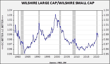
On this chart, a rising number indicates stronger large caps relative to small caps. In general, small caps tend to outperform coming out of recessions, which are shown on the chart with gray bars. The basic idea is that, going into recession, investors tend to prefer large cap stocks for the safety. Larger companies have better access to capital and can generally garner more resources to “weather the storm.” As the business cycle improves, smaller firms that have made it through the downturn are usually attractively priced and thus recover faster. Since we believe the recession is already over, we would expect smaller caps to outperform and, as the above chart suggests, there is evidence that this outperformance has already started.
Over the last business cycle, a couple of other cyclical indicators are supporting the case for small caps.
Asset Allocation Weekly (December 4, 2020)
by Asset Allocation Committee | PDF
Over the decades, keen observers of the financial markets have developed a number of theories and strategies that serve as useful tools for understanding market dynamics. One of the most famous such tools is the Dow Theory, which explains longer-term market movements based on the writings of Wall Street Journal founder Charles H. Dow up to his death in 1902. Of the many interrelated concepts that make up the Dow Theory, one that we find especially useful is the idea that stock market averages, like a broad market index and an index of transportation-related stocks, must move in a similar way to confirm that a tradeable trend is in place. When they fail to confirm each other, it’s a signal that the trend may be ephemeral or ready to reverse course.
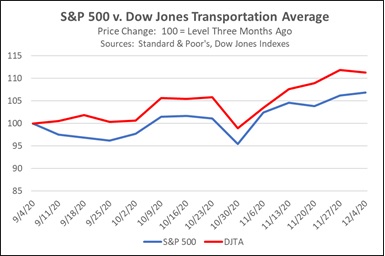
One quick, easy way to check on market-average confirmation is to compare the change in the S&P 500 Index of large cap U.S. stocks versus the change in a narrower indicator index like the Dow Jones Transportation Average (a purist would compare the Dow Jones Industrial Average against the DJTA, but the larger set of holdings in the S&P 500 probably makes it a better proxy for the broad market). Comparing the S&P 500 with the DJTA makes sense because a broad economic revival benefitting companies across most sectors should be associated with improved business conditions for railroads, truckers, airlines, and other firms involved with moving goods and people to facilitate that commerce. When there is an uptrend in the broad economy or the broad market index, but a decline in transportation activity or transport stocks, it would suggest that actual conditions are deteriorating and it may be time to look for a reversal in the stock market. While the change can be tracked over different time periods, a rolling period of three months makes sense to us.
As shown in the chart below, the uptrend in the broad market over the last three months has been nicely confirmed by an uptrend in transportation stocks. The S&P 500 (shown by the blue line) was up approximately 6.9% in the three months to the middle of this week, while the DJTA (shown by the red line) was up 11.3%. There were plenty of fundamental economic and financial reasons for the broad uptrend in stock prices over the period. Through the summer and early fall, coronavirus infections were declining and pandemic economic restrictions were being lifted in most of the country. Despite a resurgence of infections more recently, positive news on the development of safe and effective vaccines has boosted expectations that the pandemic could be overcome relatively soon. In addition, corporate profits have been recovering. All the same, the outsized gain in transportation-related stocks offered a welcome element of confirmation that provided greater confidence in the uptrend.
Another way to see the relationship is to graph the difference between the DJTA and the broad market index, as shown by the blue line in the chart below. The chart indicates that the three-month outperformance of the DJTA versus the S&P 500 peaked in mid-September, early in the period. Since then, the outperformance has gradually moderated, but it has remained positive.
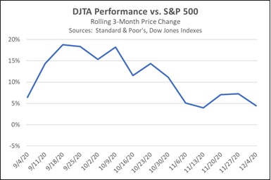
It’s important to remember that market-average confirmation is just one aspect of Dow Theory. Other aspects of the theory, such as secondary confirmation provided by trading volume, are not addressed here. Nevertheless, the DJTA’s outperformance provides a welcome piece of evidence suggesting that the recent uptrend in stocks “has legs.” When added to other, more fundamental indicators, such as the resolution of the U.S. presidential election and continued monetary stimulus from the Federal Reserve, the evidence suggests that equities could continue to appreciate in the months going forward, validating our continued exposure to stocks in our asset allocation strategies.
Weekly Energy Update (December 3, 2020)
by Bill O’Grady, Thomas Wash, and Patrick Fearon-Hernandez, CFA | PDF
Here is an updated crude oil price chart. Positive news on a vaccine for COVID-19 led to a strong rally this week, taking prices to the upper end of the current trading range.
Commercial crude oil inventories fell 0.7 mb when a 1.7 mb draw was expected. The SPR was unchanged; there is still 3.2 mb of storage in excess of the 635.0 mb that existed before the pandemic.
In the details, U.S. crude oil production rose 0.1 mbpd to 11.1 mbpd. Exports rose 0.6 mbpd, while imports rose 0.2 mbpd. Refining activity fell -0.5%.
The above chart shows the annual seasonal pattern for crude oil inventories. This week’s data showed crude oil stockpiles were steady, which is somewhat contraseasonal. Inventories are past their second seasonal peak and usually decline into year’s end.
Based on our oil inventory/price model, fair value is $44.18; using the euro/price model, fair value is $63.55. The combined model, a broader analysis of the oil price, generates a fair value of $52.78. The wide divergence continues between the EUR and oil inventory models. However, current oil prices are below all three measures of fair value, suggesting that oil prices are likely undervalued. The most important support is dollar weakness.
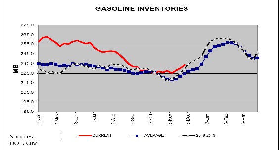
The above chart shows weekly gasoline inventories. Beginning in early November, inventories begin their seasonal increase that lasts into early February. We are clearly seeing the usual seasonal pattern develop, which means that gasoline inventories should continue to rise for the next several weeks.
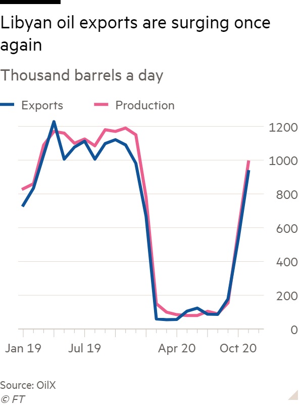
At the time of this writing, OPEC+ had not reached a decision; talks are continuing. The UAE has expanded its production capacity and would like to boost output. Iraq, which needs the revenue, would like to as well. Libyan production is recovering, adding to global supplies.
But the biggest problem facing OPEC+, and to some extent, all oil producers, is the issue of peak demand. If actions taken to manage climate change lead to less oil consumption, then oil reserve owners face the problem of stranded assets. If demand and prices are set to decline on a secular basis, then there is an incentive to produce now as the value of future oil will likely be less. It is important to remember that the reason for the collapse in oil prices in April was due, in part, to a market share war within OPEC+. Although it is difficult to parse out all the factors that played a role in the Saudis backing away from their policy of lifting market share (and, consequently, pushing down oil prices), there is a strong case to be made that President Trump’s intervention played a role. With Trump set to leave the White House next month and President-elect Biden’s policy of reducing carbon, the Saudis may be more inclined to return to their earlier policy. So far, Riyadh is holding the line on production cuts. But, if frictions rise high enough, Saudi Arabia may decide to restore discipline. We do find it interesting that, just a few short months from negative prices, the cartel is getting antsy to boost output. If OPEC+ fails to maintain production cuts, the U.S. energy industry, still struggling, will see further production declines.
In other oil and gas international news:
- Mohsen Fakhrizadeh, a leading Iranian nuclear scientist, was assassinated on Friday while traveling in a motorcade outside Tehran. Israel is thought to be behind the attack, although its policy is to never admit or deny an operation unless its personnel are caught. It appears the assassination was partially done by remote control. This isn’t the first time Iranian nuclear scientists have been targeted; at least four others were assassinated between 2010 to 2012. Iran will likely avoid escalating the situation to avoid undermining the potential for improved relations with the incoming Biden administration. In addition, Tehran will want to avoid escalation in the waning days of the Trump administration, fearing a “parting shot” from Washington. This gives Iran’s adversaries a window of opportunity to engage in attacks. At the same time, this attack, along with others, will make it difficult for Iran to change its relations with the U.S. even with a new administration in place. Iran generally doesn’t directly attack Israel, instead focusing on Israel’s overseas interests, but it will be difficult for Iran to not respond in some fashion. The trouble is that responding after the inauguration would make it nearly impossible for the Biden administration to open negotiations. The impact on markets, thus far, has been modest. Iran isn’t trading much oil so we would not anticipate any disruptions in oil supply, although there is a possibility that U.S. interests in Iraq could be targeted.
- Houthi rebels attacked the Saudi oil export facility in Jeddah earlier in the week. The missile struck a storage tank, but damage was otherwise limited.
- The administration is working to end the standoff between Qatar and Saudi Arabia. Three years ago, Riyadh established a blockade on Qatar (there were pictures of dairy cows being flown into Qatar as part of the response). According to reports, Jared Kushner is going to the region to hold talks on ending the blockade.
- Venezuela has convicted six oil executives and sentenced them to prison. They were charged with corruption.
- Europe has been restricting natural gas imports from areas where it believes methane leakages are not properly monitored and contained. Although U.S. firms have faced import restrictions from the EU, there is hope that the incoming Biden administration will be able to convince the Europeans that U.S. LNG is safe.
- Bitcoin prices have been surging recently; the “mining” of bitcoin requires massive computing power and, thus, electricity. Russians are being accused of using Abkhazia’s cheap electricity to establish server farms to mine bitcoin. In 2008, the region was invaded by Russia and is no longer under the control of Georgia. The region has claimed independence, but only a handful of nations recognize its independence. Bitcoin mining is leading to local power outages.
Hydrogen is getting a lot of press lately. Japan and Australia are working on a project where the latter supplies the former with the gas from coal. South Korea and China are also working on projects. There are reports that salt mines are being prepared to inventory to product. Even pundits are getting involved.
A massive solar project is being planned in Texas, the largest in the U.S. Of course, with solar and wind, battery storage remains an issue. Batteries are seeing new investment as well. And, there is new research in recycling oil EV batteries, which may further increase storage capacity. The commitment to EV by car companies appears to be increasing; General Motors (GM, USD, 44.68) has decided to exit the lawsuit it had joined against California over emissions standards.
Although propane fundamentals do not suggest a supply problem, a rise in outdoor dining has led to restaurants firing up portable heaters, which is leading to localized shortages.
Finally, the CFTC did not blame anyone for the oil price declining into negative territory in April. We suspect that passive investment played a major role in the decline, but government regulators were unable to make a determination. It is possible this decision could be revisited under the new administration.
View PDF
Business Cycle Report (November 25, 2020)
by Thomas Wash | PDF
The business cycle has a major impact on financial markets; recessions usually accompany bear markets in equities. The intention of this report is to keep our readers apprised of the potential for recession, updated on a monthly basis. Although it isn’t the final word on our views about recession, it is part of our process in signaling the potential for a downturn.
In October, the diffusion index rose further above contraction territory, signaling that the economy remains on track to expand in Q4. Financial markets were weaker as equities dipped and the yield spreads widened. Meanwhile, the labor market continues to show signs of improvement as firm hires remain strong. However, the lack of progress on additional fiscal stimulus continues to weigh on growth expectations as concerns over slowing consumer spending continue to mount. As a result, four out of the 11 indicators are in contraction territory. The reading for October rose from +0.1515 to +0.2121, above the recovery signal of -0.100.
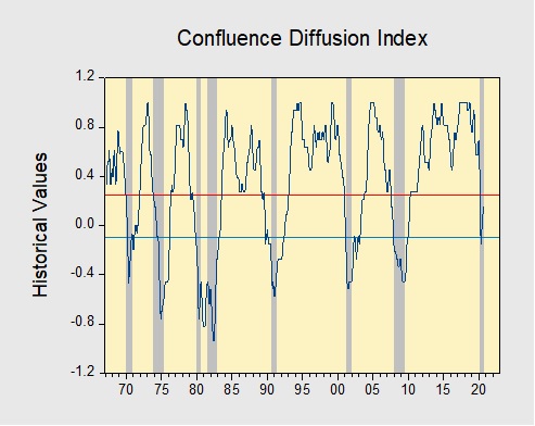
The chart above shows the Confluence Diffusion Index. It uses a three-month moving average of 11 leading indicators to track the state of the business cycle. The red line signals when the business cycle is headed toward a contraction, while the blue line signals when the business cycle is headed toward a recovery. On average, the diffusion index is currently providing about six months of lead time for a contraction and five months of lead time for a recovery. Continue reading for a more in-depth understanding of how the indicators are performing and refer to our Glossary of Charts at the back of this report for a description of each chart and what it measures. A chart title listed in red indicates that indicator is signaling recession.
Weekly Geopolitical Report – The Disputed Territory of Nagorno-Karabakh: Part I (November 23, 2020)
by Thomas Wash | PDF
(Due to the Thanksgiving holiday, our next report will be published on December 7, 2020.)
On November 9, Armenia agreed to give up some of its territory to Azerbaijan in a deal brokered by Russia. After six weeks of fighting and three failed ceasefires, Azerbaijan and Armenia have ended their war over the disputed territory of Nagorno-Karabakh. In accordance with the agreement, Armenia vacated the disputed territory on November 15. Following the departure, Russia deployed 2,000 peacekeepers to the region to ensure a smooth transition. Turkey, which provided Azerbaijan with military support, was also able to stake its claim in the region. Unlike the previous three ceasefire attempts, this one appears to be holding.
The truce freezes conflict between the two rival nations, while bolstering Russia and Turkey’s influence in the region. The absence of the West’s involvement in negotiations suggests that its role as power broker could be shrinking in favor of regional competitors. Over the last several years, Turkey and Russia have expanded their reach into Eastern Europe, the Middle East, and Northern Africa, thus filling a leadership void left by the West. If this trend continues, we believe it could raise the likelihood of increased geopolitical tensions as regional powers compete for influence.
In Part I of this report, we will focus on the history of the tensions between Armenia and Azerbaijan. We will begin with a summary of the geography of the Nagorno-Karabakh territory, followed by a discussion of Russia’s invasion of the Caucasus during Russia’s Imperial era and its downfall. We will then examine the conflict between Azerbaijan and Armenia following the dissolution of the Soviet Union, with a more detailed summary of the recent conflict between the two regions.