Asset Allocation Bi-Weekly – The Cap-Weighted and Equal-Weighted S&P 500 (September 8, 2025)

by Patrick Fearon-Hernandez, CFA | PDF

There are many ways to describe the strong performance in large cap US stock prices this year. You could simply call it a bull market, with the S&P 500 total return index up 31.2% since its low in early April and up 11.5% year-to-date. The strong buying pressure could even be called a “euphoria.” With continued gains, it would be no surprise if some observers started referring to it as a return to the type of “irrational exuberance” seen in the 1990s. In any case, the market is exhibiting strong momentum, especially in the growthy sectors such as Information Technology and Communication Services. Indeed, investors now widely understand that the lion’s share of the uptrend this year has come from just a few stocks within those sectors, i.e., the Magnificent 7. A key question is whether these trends will continue. And to the extent that there is a risk of these trends reversing, is there a good way to hedge the associated downside risk?

The growth of index investing in recent decades is probably one reason for the outperformance of large cap growth stocks like the Mag 7. Many individual and institutional investors simply channel their US large cap stock investments into funds tracking the S&P 500 Index, where each holding is weighted by the stock’s total market capitalization. Funds channeled into this version of the S&P 500 go disproportionately to those stocks with big market caps, especially the Mag 7, helping them appreciate even more. But there is also a version of the S&P 500 in which the allocation to each stock is an equal 0.2% — the S&P 500 Equal Weight Index. In this methodology, stocks with smaller capitalizations and more “value” characteristics have a higher representation than they do in the capitalization-weighted version. If we compare the performance of the cap-weighted S&P 500 to that of its equal-weighted counterpart, we can get a sense of the relative advantages or disadvantages of each index during different market scenarios.

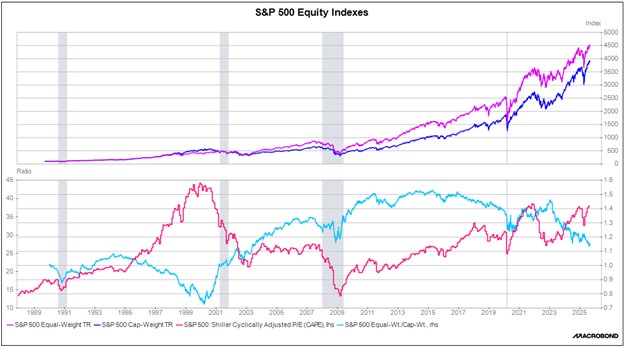
In the upper panel of the following chart, we show the S&P 500’s total return index in both its cap-weighted and equal-weighted forms, with each based to 100 in January 1990. The figure shows that over the last 35 years, the equal-weighted variation of the S&P 500 has produced a meaningfully higher total return than the market cap-weighted one. (Consistent with finance theory, the higher return for the equal-weighted index also comes with a higher standard deviation.)

Importantly, the relative performance of the two indexes changes over time. In the bottom panel of the chart, the light blue line shows the relative performance of the equal-weighted index to that of the version weighted by market cap. We have also included the Case-Shiller cyclically adjusted price/earnings ratio as a measure of average stock valuation.

In the bottom panel, the long downtrends in the blue line from 1995 to 2000 and from 2015 to the present coincide with periods of intense market enthusiasm, strong momentum in big, popular growth stocks, and lagging performance in relatively smaller, less growthy stocks. These periods generally happen when investors are pouring funds into the market and driving up valuations. In these periods, including the present, it can be tempting for investors to just focus on the large cap growth stocks driving the market. However, the chart clearly shows that when market enthusiasm eventually reverses and investors pull out of the market, the relative advantage of the equal-weight index snaps back sharply. This reflects the sudden sell-off in trending, growthy, highly weighted stocks during such periods. In sum, the bottom panel illustrates how concentration risk increases in long, strong bull markets. This tends to set the stage for sharp portfolio declines when markets go into reverse, even for investors who think they are well diversified because they are invested in the cap-weighted S&P 500.

The lesson from this discussion is that while fast-rising large cap growth stocks like the Mag 7 may still have some momentum left, investors should also consider broad diversification with meaningful exposure to undervalued and overlooked stocks, which could have the potential for solid, longer-run returns.

Don’t miss our accompanying podcasts, available on our website and most podcast platforms: Apple | Spotify 

View PDF

Asset Allocation Bi-Weekly – Household Cash Levels and the S&P 500 (December 9, 2024)

by the Asset Allocation Committee | PDF

Retail money market levels remain elevated.

This chart shows the weekly Friday close for the S&P 500 along with the level of retail money market funds. In general, cash being held can either remain held, be used to purchase goods and services, or be used to buy financial or real assets. If the liquidity isn’t available, it doesn’t necessarily mean goods and services or financial assets can’t be purchased. It does mean, however, that some lender must provide funds for the purchase or some other asset must be sold to provide the liquidity. On the other hand, if cash is available, it makes the conversion easier. Since 2022, the level of money market funds has soared. Despite these high levels of money market funds, the S&P 500 has continued to move higher.

Note that after both the 2009 lows and the post-pandemic recession, we saw a rally in equities and a corresponding decline in money market funds, suggesting the rallies were supported by using the liquidity of money market funds to buy stocks. The areas in orange on the chart show how equity market uptrends tend to stall when retail money market levels decline to around $940 billion.

One of the often-heard comments in the financial media is that equities will be supported due to the elevated levels of liquidity available. However, there is an issue with this statement: How does one determine “elevated”? The usual way is to scale the level of liquidity to some other relevant variable. It is not uncommon to scale the level of retail money market funds to stock market capitalization; this would tell you where the level of cash is relative to the overall equity market. By this measure, the level of retail money market liquidity is unremarkable. However, this may not be the best way to scale this variable. Since cash could be spent on goods and services, it might make sense to measure cash levels against spending. If cash levels are low relative to spending, it may suggest that this liquidity won’t be used for financial assets but to support future spending.

Another complicating issue is that there is a clear divergence in asset allocation and income classes. The top quintile is the only one in the US that has its largest allocation in equities. The remainder of the income classes have residential real estate as their primary asset. Thus, focusing on the cash available to the top quintile is likely to have the greatest impact on equity markets.

The level of cash by income quintile is made available in the Federal Reserve’s Financial Accounts of the US, often referred to as the flow of funds account. To scale this cash, we then looked at the past four decades’ average consumption by quintile.

Although poorer households have the largest marginal propensity to consume, the top 40% of households represent over 60% of consumption.

In the next step, we compared the level of cash of the top quintile to their average consumption. This gives us a sort of “velocity” measure of their spending. The lower the velocity, the more cash available for financial assets.

For the lowest quintile, the cash level to consumption ratio fell moving into the pandemic, then rose steadily, suggesting a rather high level of consumption relative to cash. This may account for the low level of sentiment about the economy as recently noted in the political media. Compare that to the highest quintile on the right graph. The spending to cash ratio has been steadily declining and, at current levels, suggests more-than-ample liquidity for purchasing financial assets (or, to be fair, more goods and services).

Overall, we conclude that the level of liquidity will likely be a supportive factor for financial assets, including equities. Obviously, there are several factors that will determine how this cash might be deployed. For example, the cash might find its way into private markets, or if cash yields are attractive enough, it may simply “stay put.” However, with the Fed easing monetary policy, the odds are increasing that this liquidity will find its way out of cash. Thus, investors should be prepared that the equity markets, which appear richly valued at present, could become even more overvalued.

View PDF

Is It Different This Time? (December 2023)

A Report from the Value Equities Investment Committee | PDF

For the better part of the past seven years, the broad indexes have been driven by the strength of a handful of mega-cap technology-oriented businesses, namely: Alphabet, Amazon, Apple, Meta, Microsoft, NVIDIA, and Tesla. The narrow focus is beginning to cause some investors to question if there has been a permanent shift in the investment environment, a shift that is so noticeably different from the past that we need to discard the traditional rules of investing and conclude that “this time is different.” That last phrase is credited to Sir John Templeton, investor and philanthropist, who often stated that those are the four most dangerous words for investors. Heeding Sir John’s advice, one should be wary of assuming that current market conditions and trends will persist indefinitely. The failure to recognize underlying similarities to past events may lead to irrational expectations and imprudent investment decisions. This Value Equity Insights report strives to offer some perspective on the bifurcation that has occurred in the current market and provide some historical context in order to help investors navigate the investment landscape more safely.

Background

The market cap-weighted indexes, such as the S&P 500, have been heavily influenced of late by the mega-cap names, and more specifically, the seven technology-oriented businesses mentioned earlier which have been referred to in the media as the Magnificent Seven (M7) due to their recent stellar returns. While the M7 businesses have benefited from a handful of trends centered around a more connected, intelligent, and mobile society (not to mention the COVID lockdowns), their relative stock performance has created a bifurcated and very concentrated market, one that has parallels to many of the past periods of excessive exuberance.

Read the full report